Overview
The Fill Rate Dashboard allows you to monitor and analyze your Order Fill Rate, which is the percentage of orders that have been fulfilled versus those that have been cancelled. This metric is crucial in assessing your ability to meet customer demand. By tracking this rate, you can understand why orders have been cancelled and identify areas for improvement.
The Fill Rate Dashboard includes several color-coded graphs and charts that give a visual snapshot of the fill rate and information about order fulfillment and cancellations. You can easily see the number of cancelled and fulfilled orders and the top cancelled products during specific time frames.
Fill Rate Dashboard
To access and use the Fill Rate Dashboard:
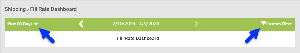
- Go to Reports > Shipping > Fill Rate Dashboard.
- Click Custom Filter at the top right to filter the dashboard by Company, Company Groups, Channel, or Custom Date Range. You can also set the date range by clicking one of the predefined time frames (Yesterday, Past 7 Days, etc.) at the top left of the page. These options control what is displayed on all sections of the dashboard.
- The dashboard is comprised of the panels described in the following sections.
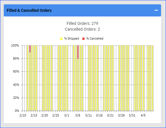
Filled & Cancelled Orders
This panel shows the percentage of shipped versus cancelled orders per day over your specified date range. The total numbers of Filled and cancelled orders appear above the bar graph.
You can click the % Shipped or % cancelled to hide/show orders in the bar graph.
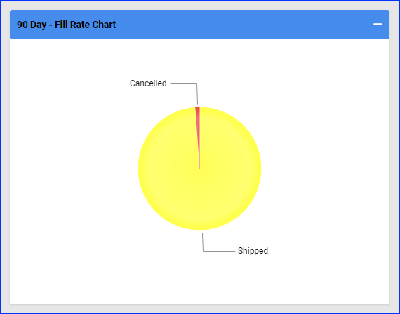
Fill Rate Chart
This panel shows the total percentage of shipped orders versus cancelled orders over the specified date range. The exact numbers are shown when you hover over a portion of the chart.
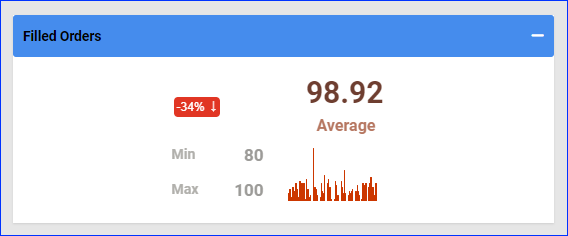
Filled Orders
This panel shows the Average, Minimum, and Maximum filled rates during the selected date range. It also shows the percentage change compared to the previous period.
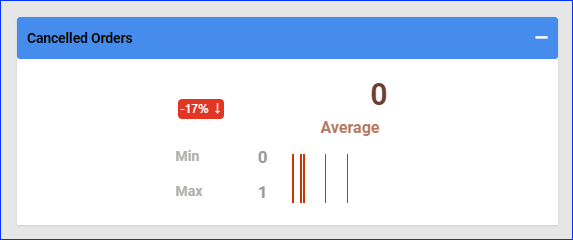
Cancelled Orders
This panel shows the average, minimum, and maximum cancelled rate during the selected date range. In addition, you can see the percentage change compared to the previous period.
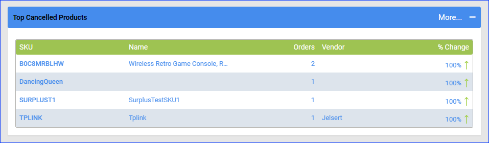
Top Cancelled Products
This panel shows the top five cancelled products over a date range. You can also see the number of cancelled orders and the percentage change compared to the previous period. Click More in the top right corner to open a page with all of the cancelled products in your date range, which you can export to Excel.