Overview
In this article, you will learn about Sellercloud’s Inventory Value Dashboard. This report helps you monitor and track the value of your inventory within specific date ranges.
You can see information about the following:
- The total inventory value for each day of a specific period
- The average inventory value for a particular period
- The average inventory value of your reserved quantity
- The value of products in unreceived purchase orders
- Products with the highest cost
- How many times has inventory been sold and replaced over a specific period
For key points about Sellercloud’s Inventory reports, see the Inventory Value Reports Overview.
Access the Dashboard
To access the report, follow these steps:
- Navigate to Reports > Inventory > Inventory Value Dashboard.
- Use the options on top to select what the dashboard shows. The selection will affect all graphs except the Inventory Turnover.
- Click the Date menu on the top left to select a preset time period.
- Click the Previous Period and Next Period arrow icons to go back or forward the same number of days you selected. For example, if you select Past 7 days on the left, clicking the left arrow will take you seven days back.
- Use the Custom Filter on the top right to customize the dashboard further. You can select Companies, Company Groups, Channels, Warehouses, a custom Start and End Date, and optionally, check Do Not Include Dropship Warehouses.
Dashboard Data
In this section, you will learn about each graph on the dashboard.
Current Inventory Value
This graph shows the total inventory value for each day in the selected date range. It includes both available and reserved and sellable and unsellable warehouses.
Place your mouse pointer over a specific day to see the inventory value for that day.
Inventory Turnover
This graph shows how many times inventory is sold and replaced over a selected date range, calculated by the Cost of Goods Sold (COGS) divided by the Average Inventory.
For example, if the COGS was 200,000 over 180 days, and the Average Inventory is 20,000, then the Inventory Turnover is 10. You turned the inventory over 10 times in the past 180 days.
Unlike the other charts, this one has its own date range filter.
Total Value
This graph shows the average inventory value for the selected date range. The average value is the sum of each month’s average inventory divided by the number of months.
Reserved Qty Value
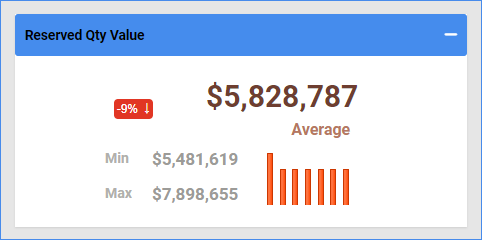
This graph shows the average value of your product inventory reserve for the selected date range.
On Order Value
This graph shows the value of items in unreceived purchase orders for the selected date range. Purchase orders must be marked as approved to be included in the data.
Top Products By Inventory Value
This graph shows the products with the highest cost for the selected date range.


